


Hi!
In this post I will show how to create dark mode using Sass variables.
HTML
To switch between the modes we will use button. The rest is just test markup to test if our theme is working.
<button class="theme" onclick="setTheme()">Theme</button>

  <div class="container">
    <h1>Title</h1>
    <p>Some other text</p>
  </div>
SASS
To create the theme we will create two sets of variables using Sass. As you can see below our variables have same names but color values are different.
This will allow us to switch between light and dark classes and colors in our variables will change.
:root,
:root.light {
  --bg-color: #fff;
  --secondary-color: #242424;
  --third-color: #8190a4;
}

:root.dark {
  --bg-color: #121212;
  --secondary-color: #fff;
  --third-color: #8190a4;
}
Now we can use our variables as colors in our elements.
body{
  margin: 0;
  background-color: var(--bg-color);
}
.theme{
  margin: 20px;
  padding: 10px 30px;
  font-weight: 900;
  border-radius: 25px;
  border: none;
  cursor: pointer;
  color: var(--secondary-color);
  background-color: var(--third-color);
}
.container{
  width: 300px;
  height: auto;
}
.container {
  h1, p{
    margin: 20px;
    color: var(--secondary-color)
  }
}
JS
Lastly we need short function to toggle between our theme classes
If class is already set to light we change it to dark if its light we leave it as light.
const setTheme = () => {
  document.documentElement.className == 'light' ?
  document.documentElement.className = 'dark' :
  document.documentElement.className = 'light'
}
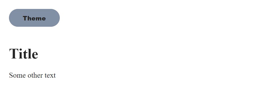
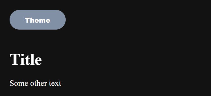
And final result should look like this.
Light mode.
Dark mode.
If you find any mistakes or you have ideas how to refactor my solutions to be simpler/ better please let me know :)