

Photo by Clark Tibbs on Unsplash
Custom modal with JS and Sass
Creating custom modal popup with JS and styling it in Sass


Hi!
In this post I will try to create custom modal popup with JS. For styling I will use Sass.
How to set up Sass
- Install node and npm
- Install SASS from your command line using npm install -g sass
- Once done, you need to install an extension in VSCode that watches your SCSS files and converts them to regular CSS each time you save. Download the Live SASS Compiler extension in VSCode
- Create styles.scss file and click Watch Sass located on the bottom of VSCode
Functionalities
- modal should open on page load
- modal will contain input field and subscribe to newsletter button
- modal should be closed when clicked x or area around popup
HTML
<div class="alert-popup" id="alert-popup">
    <div class="alert-title">Subscribe to our newsletter!</div>
    <div class="input-wrap">
      <input type="text" id="subscribe" name="subscribe" placeholder="e-mail">
      <button id="subscribebtn" onclick="closePopup()">Subscribe</button>
    </div>
    <a href="#" class="close" onclick="closePopup()"></a>
  </div>
  <div class="tint-background" id="tint-background"></div>
With our HTML markup we end up with something looking like this.

Sass folders setup
Using Sass we can set up variables, this allows us to have for example color as a variable. Then using it through our entire project if we decide at the end that we would like to change it, we can just change our variable and whole project will be updated.
It could be useful for example when creating dark mode, you can assign two sets of variables and basing on mode type you can switch colors.
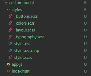
In my project I also wanted to separate buttons styles, typography and layout so it looks like this.
Setting up colors
Okay so we should start from choosing some colors for our modal. This is how you can assign colors to variables in Sass.
$primary-color: #98dc2b;
$secondary-color: #5e5f64;
$secondary-color-dark: #000;
$secondary-color-bright: #fff;
This was created in file _colors.scss so now we need to import it in our main file styles.scss.
@import 'colors';
@import 'typography';
@import 'buttons';
@import 'layout';


body{
   margin: 0;
}
Imports order is very important because they will be loaded from top to bottom. So for example if we style button colors using our color variables and we import colors after, our variables will not work.
Typography
Here we have only modal title, so we can style it as below
.alert-title{
  font-family: 'Roboto';
  font-style: normal;
  font-weight: 700;
  font-size: 26px;
  line-height: 120%;
  margin: 0 50px 20px 0;
}
Input and Button
I wanted to merge input together with button so it can look like one element.
Sass will allow us to style our elements like focus inside our class. So it can be easier to track what is this style for.
So style for our input you can see that I used our color variables here.
.input-wrap{
  display:flex;
  flex-direction:row;
  border: 1px solid $primary-color;
  border-radius: 25px;
  padding: 0 0 0 10px;

}
.input-wrap input {
  flex-grow:2;
  border: none;
  margin: 5px;

  &:focus{
    outline: none;
  }
}
and for our button
#subscribebtn{
  border: none;
  font-family: 'Roboto';
  font-style: normal;
  font-weight: 700;
  cursor: pointer;
  background-color: $primary-color;
  color: $secondary-color-bright;
  border-radius: 32px;
  padding: 10px 40px;
  font-size: 16px;
}
Now we should have something like this.

Modal
Next we need to add our styles to modal and to its background. I want it to be in the center of the screen and on top of our background.
.alert-popup{
  position: absolute;
  top: 50%;
  left: 50%;
  transform:translate(-50%,-50%);
  max-width: 450px;
  padding: 40px;
  background-color: $secondary-color-bright;
  z-index: 99;
}
.tint-background{
  position: absolute;
  width: 100%;
  height: 100%;
  background-color: $secondary-color-dark;
  opacity: 0.5;
}

Last thing to style will be our close button.
Close Button
.close {
  position: absolute;
  right: 32px;
  top: 32px;
  width: 32px;
  height: 32px;
  opacity: 0.5;

  &:hover{
    opacity: 1;
  }
  &:before,&:after{
    position: absolute;
    left: 15px;
    content: ' ';
    height: 33px;
    width: 2px;
    background-color: $secondary-color;
  }
}
.close:before {
  transform: rotate(45deg);
}
.close:after {
  transform: rotate(-45deg);
}
And our styling is done!

JS logic
Now we need our popup modal to appear on page load. I would like to set it up one second after page is loaded.
First thing to do is hide our modal and background. So we add to .alert-popup style display:none and the same for our .tint-background
To display it back we need to create a function that will be triggered on window load.
const popup = document.querySelector('#alert-popup')
const tint = document.querySelector('#tint-background')

window.onload = function(){
  setTimeout(function(){
    popup.style.display = 'block'
    tint.style.display = 'block'
  }, 1000)
}
As we refresh the page we can see that our modal appears after one second.
Next we need to allow user to close it :)
I will create function closePopup that will be binded to our close button and subscribe button. Also I want to add EventListener to check if user clicks on the background and then also close it.
function closePopup(){
  popup.style.display = "none"
  tint.style.display = "none"
}
tint.addEventListener("click", ()=> {
  closePopup()
})
And that should be it, now we have custom modal with newsletter subscription. In full application of course our Subscribe button will call one more function that will save user email in our database but in this example there is no need for this.
If you find any mistakes or you have ideas how to refactor my solutions to be simplier/ better please let me know :)